Gridscape

Application Development

Overview

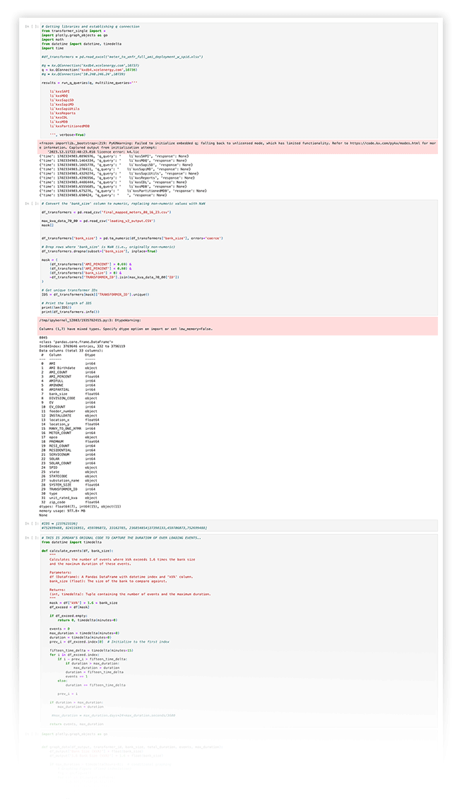
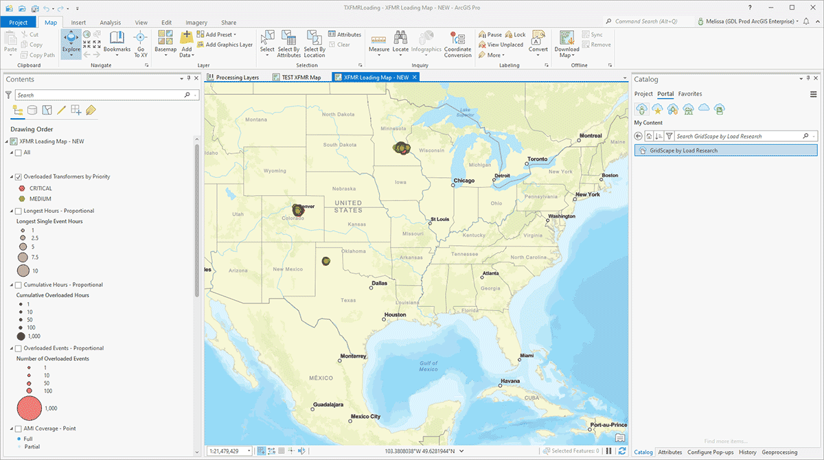
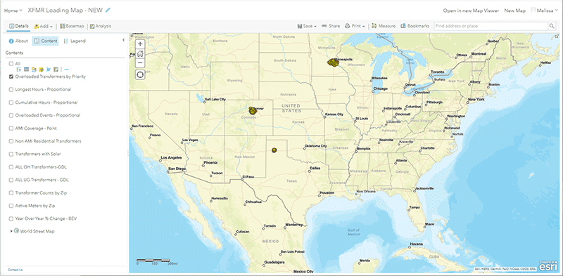
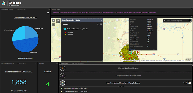
The geospatial tool GridScape was collaboratively developed by a team of 4, including myself, to address an immediate need for distribution system insights. It provides a holistic view of the service territory, transformer triage, solar insights, meter, transformer, and electric vehicle density, as well as downloadable data metrics. The development process involved requirement gathering, design, development, testing, deployment, and maintenance, and it leveraged specialized GIS tools (ArcPy,  and libraries, such as Python and R, for application development. 

Transformer Load Analysis with AWS S3 and PyKX

The AMI data was retrieved via S3 AWS using with the data being in 15-minute increments. The code for this process was primarily written by another team member, although I provided significant input into its creation and subsequent updates. The data analysis involved comparing each transformer's 15-minute load to its rated KVA. This analysis was based on underlying GIS data, which was a collaboration between myself and the GIS department. The GIS data delivery included a list of every transformer on the grid, all the customers connected to each transformer, and additional attributes per transformer, including KVA.

The analysis also involved identifying overload events based on engineering standards, with the duration of the longest overload event recorded as Longest Single Event Hours. Additionally, all hours for all overloaded events per transformer were recorded as Cumulative Overloaded Hours. The analysis further categorized transformers as critically overloaded if they exceeded 8 hours in a single event, and as medium overloaded if they were under 8 hours in a single event. Graphs were produced for each transformer, showing the KVA load, overload indicators, and real load over time.

GIS Data Management
with AWS S3 and ArcGIS

I am solely responsible for loading the resulting dataset into an ArcGIS Project, as I am the only GIS knowledgeable staff member. I update geodatabases with the information and then connect data from the GIS Data Lake (GDL), where I collaborated with the GIS department to gain access before anybody else in the company. Additionally, I enrich the data by adding details such as county and city based on GDL polygons.

When working with geodatabases in ArcGIS, there are various methods to create and manage datasets, including designing and creating an empty geodatabase, copying and modifying an existing geodatabase schema, and creating a copy of both the schema and contents from an existing geodatabase. Furthermore, the process of updating data sources and managing data loading workflows in ArcGIS involves specific tools and workflows to ensure the accuracy and integrity of the geospatial data.

Cloud-Based GIS Visualization
with ESRI REST Services

The data is published to cloud ESRI REST services and visualized in a map, with several layers added. The map prominently displays the counts of critical to medium overloaded transformers and their locations. Additional layers include the percentage of AMI coverage per transformer, transformers with solar customers, and additional field attributes from the GIS Data Lake. Moreover, polygon choropleth layers show current active meters, and transformer counts gradiently colored by zip. Another layer shows year-over-year changes in EV registrations, which was calculated in another project (EV Engineering Insights Dashboard) and added to provide insights into the overloaded issues. Each layer in the map is configured with a popup showing, per transformer, customer counts, total solar capacity (for those with solar), EV participants, Xcel Company code, as well as a specially designed link to the related overload graph.

When working with ESRI REST services and creating map visualizations, it's essential to ensure that the data layers are well-organized and provide meaningful insights for the intended audience. Additionally, configuring popups with relevant information enhances the usability of the map for data exploration and analysis.

Real-Time Visualization
of Transformer Overloads

The described process involves visualizing the location and status of overloaded transformers in an app, along with various layers of additional information. The app displays the counts of all overloaded transformers, sorted in descending order of the highest number of events, longest hours for a single event, and maximum cumulative hours from multiple events. This visualization serves as a feedback loop, as engineers use the product to investigate the reasons for transformer overloading. Reasons for overloading may include incorrect GIS data, transformer size discrepancies, or connectivity issues, which are then corrected via requests to GIS. The process also involves comparing the updated data with the GIS Data Lake and running the selected transformers through the kx pull process to obtain updated information.