AMI Meter Rollout

SAP Visualization

Overview

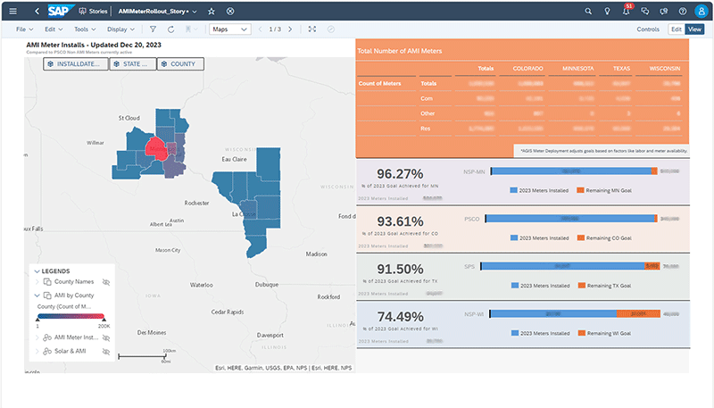
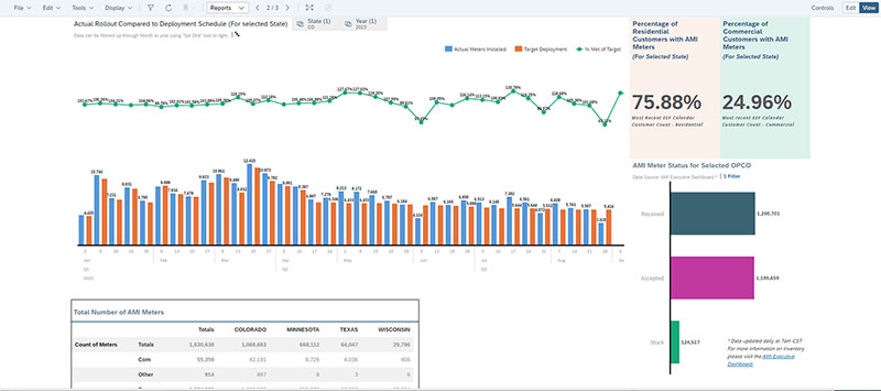
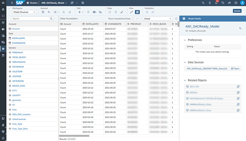
The AMI Rollout Dashboard is a comprehensive SAC dashboard designed to track the installation of AMI meters across 8 states. It provides detailed insights for executives and analysts, including the number of meters installed by state, county, date, and customer type. The technical implementation involves data extraction from Teradata SQL tables, creation of SQL views, and the use of Python for data manipulation and correction. The dashboard includes various visual elements such as maps, tables, and charts, and is built to comply with SAC model standards. The project also involved collaboration with various teams, including GIS, IT, and the Director of Metering. Notably, the dashboard has gained recognition for its user-friendly interface and has provided valuable transparency for the AMI rollout.

The project showcases the following key points:

• Development of a sophisticated dashboard for tracking AMI installations across multiple states.

• Technical implementation involving Teradata SQL, Python, and various data manipulation and visualization tools.

• Collaboration with multiple teams, including GIS, IT, and metering, to ensure data accuracy and dashboard usability.

• Recognition from senior leadership for the effectiveness and simplicity of the dashboard.

The Code

The code I built for this project involves pulling data from Teradata SQL tables, creating SQL views, and using Python for data manipulation and correction. Here are the technical highlights:

• Data Extraction: I created an initial SQL view to pull 16 attributes from 7 different views and tables from Teradata using queries, joins, and nested queries.

• Python Data Manipulation: I used a Python query with 977 lines of code to pull in 6 more attributes, such as billing code and solar information.

• Data Correction: A significant part of the code was dedicated to correcting coordinates, including pulling data from an alternative GIS specific table and using the Google API for coordinates.

• Data Visualization: I used Folium to inspect persistent or extremely odd anomalies in the data.

• Data Export: The processed data was exported to a CSV format friendly to SAC model standards, including date and number formats.

• Document Generation: I created a document that compares installs to the deployment schedule and the monthly company sales by customer group, which was also exported to a CSV format.

• Data Model Update: Each CSV file updates its own data model.

The code for the project makes use of several Python packages for data analysis, manipulation, and visualization. The following Python packages were utilized: Pandas, NumPy, Datetime, Getpass, OS, Teradata, SQLAlchemy, Geopandas, and Folium.

The Executive View

The front page is intended to provide executives with a clear, visual representation of key data, facilitating quick and effective insights. It features:

• A comprehensive map with five GIS layers, including Counties, AMI Counts by County, AMI Meter Installs, Non-AMI Meters, and Solar & AMI. This map provides a visual representation of various data points, allowing for a more intuitive understanding of the data.

• A detailed table of installations, categorized by State and Customer Type. This table offers a granular view of the installations, providing executives with the specific data they need to make informed decisions.

• A series of charts comparing the current year's installations as a percentage to the yearly goals by state. These charts provide a visual comparison that can help executives track progress and identify areas that may need more attention.

Meter Tracking

The second page of my SAC dashboard visualization is designed for analysts and metering department personnel, focusing on inventory and installation tracking on a weekly basis. It features a percentage comparison of installations against the total number of residential and commercial customers. Additionally, the page integrates an existing SAC model from the larger organizational models, which displays inventory counts including received, accepted, and stock meter inventory. The entire page is equipped with filters for date and state, allowing for a tailored analysis and streamlined reporting process. This setup aids in providing a clear and current overview of inventory status and installation progress, essential for operational efficiency and strategic planning.

The Models

The SAC Dashboard comprises three models, with the main model featuring 16 attributes and incorporating some feature engineering. Additional columns, such as Location and Area, were created based on the coordinates, with careful consideration given to the data modeling process to meet SAC requirements and visualization needs. The universal applicability of this model was also a key consideration, given its intended sharing across the organization. The second model, used on the secondary page, focuses on the number of installs by state and date, with similar attention to ensuring its universal suitability. Furthermore, a SAC Universal Dataset from a larger AMI project tracker was reverse engineered to align with the specific requirements of this project.